
Getting started with Bulma
23 Sep 2019 - John
As beginner web developers, we are so preoccupied with making things work, that we completely neglect the aesthetic side of things. As a result, we often Getting started with Bulmaend up with brilliant pieces of work that while completely funcional, look plain ugly.
"But John, I have a deadline and I just need my app to pass the tests. Besides, there is Bootstrap!" Yes, Bootstrap is still a very relevant and valid option for any project, but sadly, it is often overkill and bloated. Enter Bulma.
According to its creator, "Bulma is a free, open source CSS framework based on Flexbox and used by more than 150,000 developers." It claims to be an alternative to Bootstrap that offers bleeding edge features in a lightweight package that uses no javascript, all in a very simple to use fashion. This does not mean, however, that Bulma is meant to rival or substitute Bootstrap. Instead, it is an alternative to use in specific scenarios.
When should I use Bulma?
You should only use Bulma for projects in which you need a quick way to get a grid system up and running without too much fuss, when you want FontAwesome support or when you plan to write your own javascript or jquery plugins. However, if you need IE support, don’t have the time to write your own jquery plugins or you need additional accessibility features, you should stick with Bootstrap. It is also worth noting that while Bulma is very easy to use, it’s documentation is a little bit lacking and it still doesn’t have a very big community around it.
Cool, how do I start?
The beauty of Bulma lies in how easy it is to set up. You just need to add the following three lines to your HTML:
<meta name="viewport" content="width=device-width, initial-scale=1">
<link rel="stylesheet" href="https://cdnjs.cloudflare.com/ajax/libs/bulma/0.7.5/css/bulma.min.css">
<script defer src="https://use.fontawesome.com/releases/v5.3.1/js/all.js"></script>
And you’re all set! You now have access to all the styles provided by Bulma and all you need to do is call them on your HTML to go from this:
To this:

All right, I’m, what else should I do?
Let’s start with the basic empty page and add the required lines:
<!DOCTYPE html>
<html lang="en">
<head>
<meta charset="UTF-8">
<meta name="viewport" content="width=device-width, initial-scale=1">
<link rel="stylesheet" href="https://cdnjs.cloudflare.com/ajax/libs/bulma/0.7.5/css/bulma.min.css">
<script defer src="https://use.fontawesome.com/releases/v5.3.1/js/all.js"></script><title>Document</title>
</head>
<body>
    <!-- OUR STUFF GOES HERE -->
</body>
</html>
And then let’s add our content between the <body> tags:
<div> <!-- This is our first div -->
<img src="images/profile.png" alt="Profile pic">
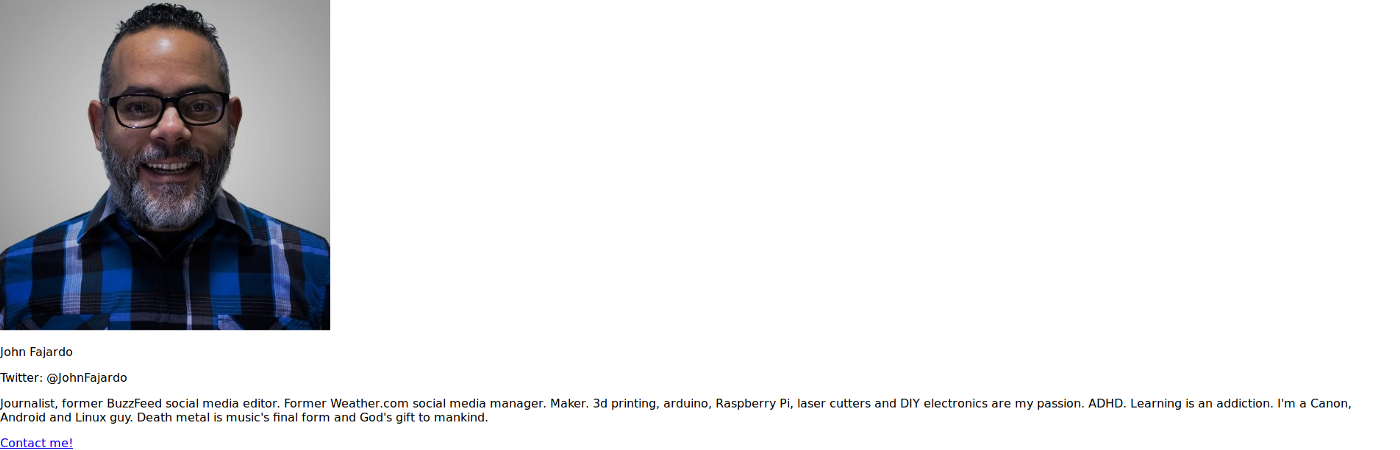
<p>John Fajardo</p>
<p>Twitter: @JohnFajardo</p>
<p>Journalist, former BuzzFeed social media editor. Former Weather.com social media manager. Maker. 3d printing, arduino, Raspberry Pi, laser cutters and DIY electronics are my passion. ADHD. Learning is an addiction. I'm a Canon, Android and Linux guy. Death metal is music's final form and God's gift to mankind.</p>
<p><a href="#">Contact me!</a></p>
</div><!-- Ending of first div -->So far it doesn’t look like much. Just a plain old boring block of unstyled content. Let’s call some styles to make it look alive, starting with the grid structure:
<div class="section">
 <div class="container">
  <div class="columns">
    <div class="column is-4 is-offset-4">
      <div class="card">
        <div class="card-content"><!-- This was our first div-->
        <!-- Our content still goes here! -->
        </div>
       </div>
      </div>
     </div>
    </div>
   </div>
All right, things are starting to take shape. Note how by just adding a few divs with their respective classes, we get a card layout complete with alignment and borders. The fonts are applied the second you load the stylesheet, so no need to mess with them.
However, things still look a bit bland. Let’s play with the profile picture to see what we get. Our original image was built like this:
<img src="images/profile.png" alt="Pic">All we need to do is enclose it in a figure tag and add a few styles:
<figure class="image container is-128x128">
  <img class="is-rounded" src="images/profile.png" alt="pic">
</figure>
Let’s see what’s going on here:
The figure tag encloses the image in a container with an image class that is going to make the image responsive with a size of 128px. The container class is a little hack to center the image in the parent div.
Then we have our original image, but with an added class of is-rounded to make it… well, rounded.
For our user name, we just need to add a class of "title" to give it some weight and a self-explanatory class of has-text-centered.
<p class="title has-text-centered">John Fajardo</p>The Twitter button is a little bit more involved. We originally had a <p> tag around our Twitter handle. We need to change that into a <span> tag and add a few more elements:
<p class="has-text-centered">
 <a class="button is-primary">
  <span class="icon"><i class="fab fa-twitter"></i></span>
  <span>@JohnFajardo</span>
 </a>
</p>
The first <p> tag, as you already know, helps center things with its class of has-text-centered. Then we add an empty link that will serve as an "anchor" for the button and inside we add two more spans: One with the Font Awesome icon (via its corresponding class) and one more with the text we want to display. I chose my Twitter handle. Please note that you can perfectly add an href attribute to the link to make the button go somewhere, I just chose to ignore it for the sake of code brevity.

We’re almost there! Our last task is to style the footer and this one is even easier. We just have to enclose our link in a <span>tag, then enclose the whole paragraph in a <footer> tag and add all our styles:
<footer class="card-footer">
  <p class="card-footer-item register">
    <span><a href="#">Contact me!</a></span>
  </p>
</footer>
Wait a second, your footer is different than the first example, how come?
I’m glad you noticed, the reason for this is to illustrate the flexibility we have with Bulma. What if our client wants a different font or a different background? Are we limited to the styles given by Bulma?
Absolutely not. You can override any and all styles by adding a new stylesheet on your header section:
<link rel="stylesheet" href="styles.css">and you can now go to town with your own styles:
/*STYLES.CSS*/
/*We should actually use body, but there's too little content to fill the whole screen, so we use html for illustrative purposes*/
html {
  background-color: #ededed;
}
.card-footer-item.register {
  background-color: #284863;
  color: white;
}
.card-footer-item.register a {
  color: #ffffff;
}
p {
color: #999;
}
Further reading:
- Code used in this post
- Project main page
- Documentation
- How to build a responsive blog design with Bulma
- Complete course on everything Bulma
Now you have no excuse for having the default styles in your future projects. Do you know of any other CSS framework worthy of mention? Let me know your thoughts!